Words alone cannot capture the full wonder (or horror) of all the stories science had to tell this year. That’s where graphics come in. Whether visualizing the most important data emerging around the COVID pandemic, explaining some mind-bending idea in quantum physics or synthesizing the incredible journey of a parasite through three different hosts, Scientific American’s graphics editors have helped cover a plethora of fascinating topics this year. Here is just a tiny sampling of our favorites.
Two Years into COVID, Mountains of Data
In March we published a special issue on how COVID had changed the world since it was declared a global pandemic two years earlier. The graphics team was already well versed in visualizing things like COVID infection or death rates, but measuring the broader and more nuanced effects of the pandemic required more investigation. We worked with three different researchers to gather the most detailed and accurate data we could find to help tell the story of how COVID had impacted everything from the economy to education and, of course, health in the U.S. and around the globe. This graphic is just one piece of a wide-ranging exploration of the pandemic’s uneven toll, told primarily through charts.
On supporting science journalism
If you're enjoying this article, consider supporting our award-winning journalism by subscribing. By purchasing a subscription you are helping to ensure the future of impactful stories about the discoveries and ideas shaping our world today.
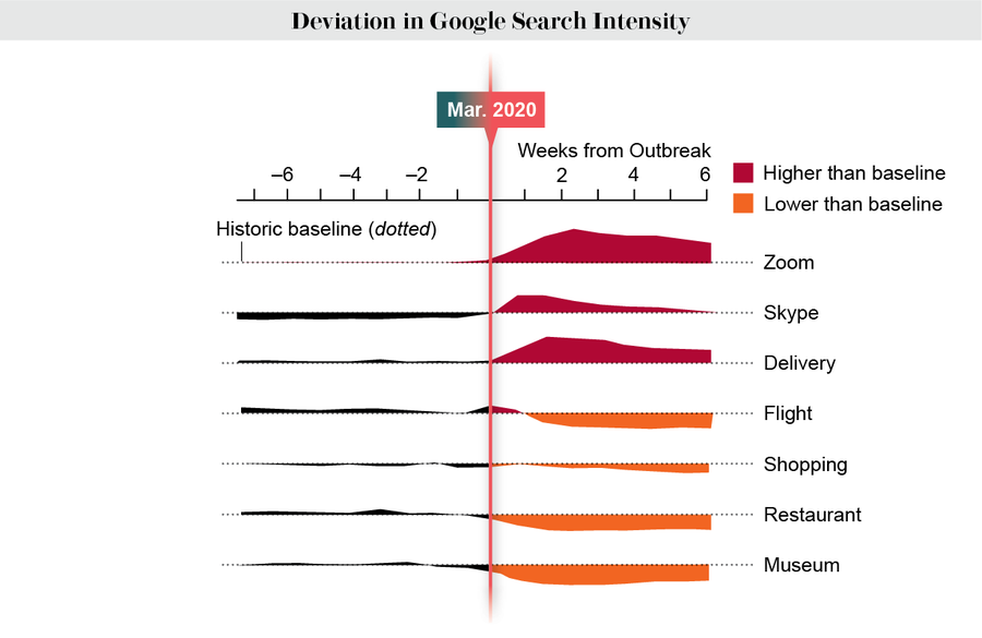
Credit: Jen Christiansen; Source: “Winners and Losers from COVID-19: Global Evidence from Google Search,” by Kibrom A. Abay at al. Policy Research Working Paper 9268, World Bank Group, Development Economics Development Research Group, June 2020
Decoding the Omicron Variant
As we reflected on the havoc COVID had already wrought, the virus that causes the disease kept doing its thing—mutating and spreading. By the beginning of 2022 Omicron had become the dominant strain in the U.S., its seeming boundless infectiousness surpassing that of all previous variants. We used graphics to break down Omicron’s threefold strategy: it wore a disguise (shown in the graphic), stabilized its spike protein and snuck in the “side door” of the cells in our airways. Luckily, it also dropped its defenses, making it less deadly than other variants.
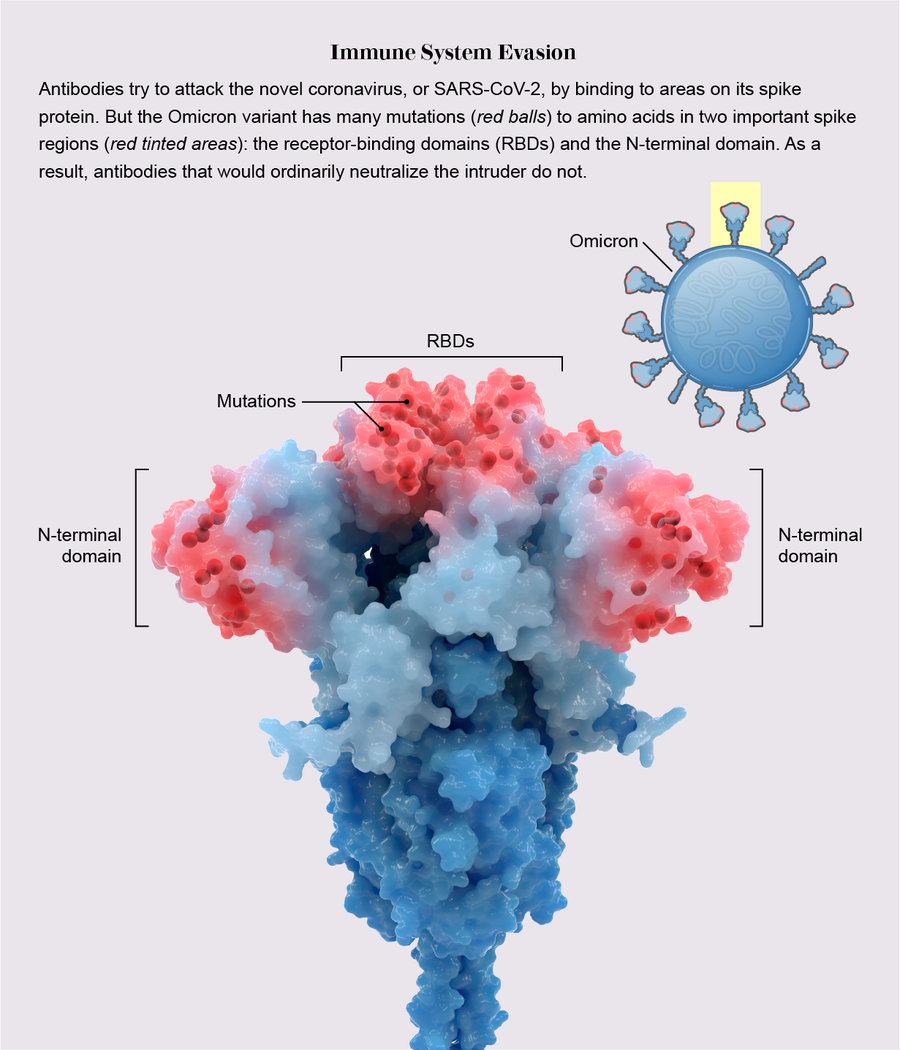
Credit: Veronica Falconieri Hays
How Politics Impacts Health
New research revealed that not only do people in Republican-leaning U.S. counties die at higher rates than those in Democratic areas, but the gap is consistent across the top causes of death—and is getting wider. Data on factors such as deaths from COVID and firearms helped tell the story of how policy choices are hurting people in the most politically conservative pockets of the country.
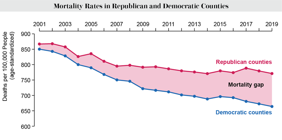
Credit: Amanda Montañez; Source: “Political Environment and Mortality Rates in the United States, 2001-19: Population Based Cross Sectional Analysis,” by Haider J. Warraich et al., in BMJ, Vol. 377. Published online June 7, 2022
Getting Warmer (in a Bad Way)
Summer 2022 was a scorcher, but data indicate that it will end up being one of the coolest of the rest of our lives. Scientific American’s resident weather expert Andrea Thompson offered a sober distillation of the science of extreme heat in a world increasingly wracked by climate change. The graphics in this story reveal how climate and weather trends led up to some of the hottest months on record, as well as how summers are projected to play out in the future.

Credit: Amanda Montañez; Source: Climate Central
Your Periodic Reminder that Parasite Life Cycles Are Bonkers
Need a break from all the bad news? Here is a little graphical palate cleanser: we visualized the life cycle of the parasite Schistocephalus solidus, which requires ingestion by a copepod, a fish and a bird—in that order—to survive and reproduce. You’ve never seen something so gross illustrated so beautifully.

Credit: Daisy Chung
New in Quantum Physics: Telepathy?
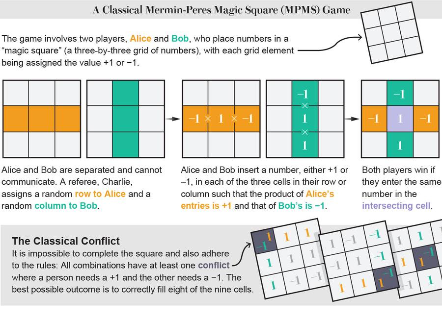
For those who like to keep their brains limber by reading about the latest developments in quantum physics, here’s a mind-bending achievement: a group of researchers in China conducted an experiment to demonstrate something called quantum pseudotelepathy. Using the framework of a Mermin-Peres magic square—a game in which two players win by correctly guessing each other’s secret moves—this story uses graphics to help explain how players could theoretically employ the rules of quantum mechanics to share information with each other telepathically (sort of), bypassing the usual limitations of the game (outlined in the graphic).
Credit: Lucy Reading-Ikkanda
Deconstructing the JWST’s Spectacular Images
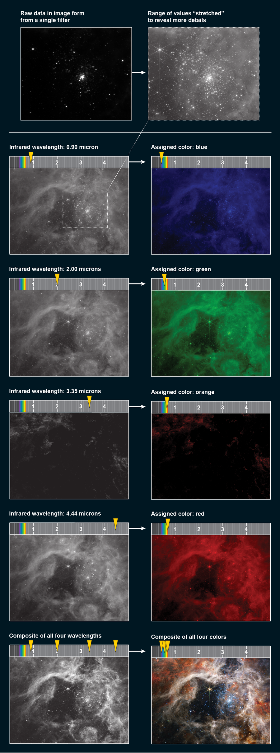
At Scientific American, we like to visualize lots of things, but what about visualizing howthings are visualized? Yup, we do that, too. Some of 2022’s most jaw-dropping photographs came from the James Webb Space Telescope (JWST), which started taking snapshots of the cosmos in unprecedented detail earlier this year. But how, exactly, are the data encoded by this magnificent instrument translated into the gorgeous, twinkling images we have been drooling over since July? This graphic-centric story reveals the science behind the pictures, from the four instruments that make up the telescope itself to the techniques that scientists on Earth use to distill the data for consumption by our human eyes.
Credit: Jen Christiansen (graphic); NASA, ESA, CSA, STScI and Webb ERO Production Team (image source)
