Well, it’s hard to believe, but we redesigned Scientific American—again.
Today we introduce the redesign to the world. While I’m proud to have been able to do this twice, it’s hard to believe how much work that was done. (And when I say “we,” I mean the whole staff with the assistance of the design firm Pentagram. It couldn’t have been done without everyone’s help.)
When we decided to redesign the magazine almost a year ago, we weren’t upset with the way it’s looked over the previous 12 years but rather wanted to bring new life to it and keep things relevant because the world has changed a great deal since our redesign in 2010. Namely, the landscape of publishing has shifted like the supercontinent Pangaea, compared with the continents today. More importantly, our online presence has expanded in ways that the founders of this venerable institution could only dream of. That left us with some real questions about our appearance that we needed to sort out. While our website has a lot of traffic, its visual presentation had been distinctly crafted for our print audience. So this was a primary driver and desire for change: making sure that we stand out as the premiere science publication in the U.S. and world, both in print and online.
On supporting science journalism
If you're enjoying this article, consider supporting our award-winning journalism by subscribing. By purchasing a subscription you are helping to ensure the future of impactful stories about the discoveries and ideas shaping our world today.
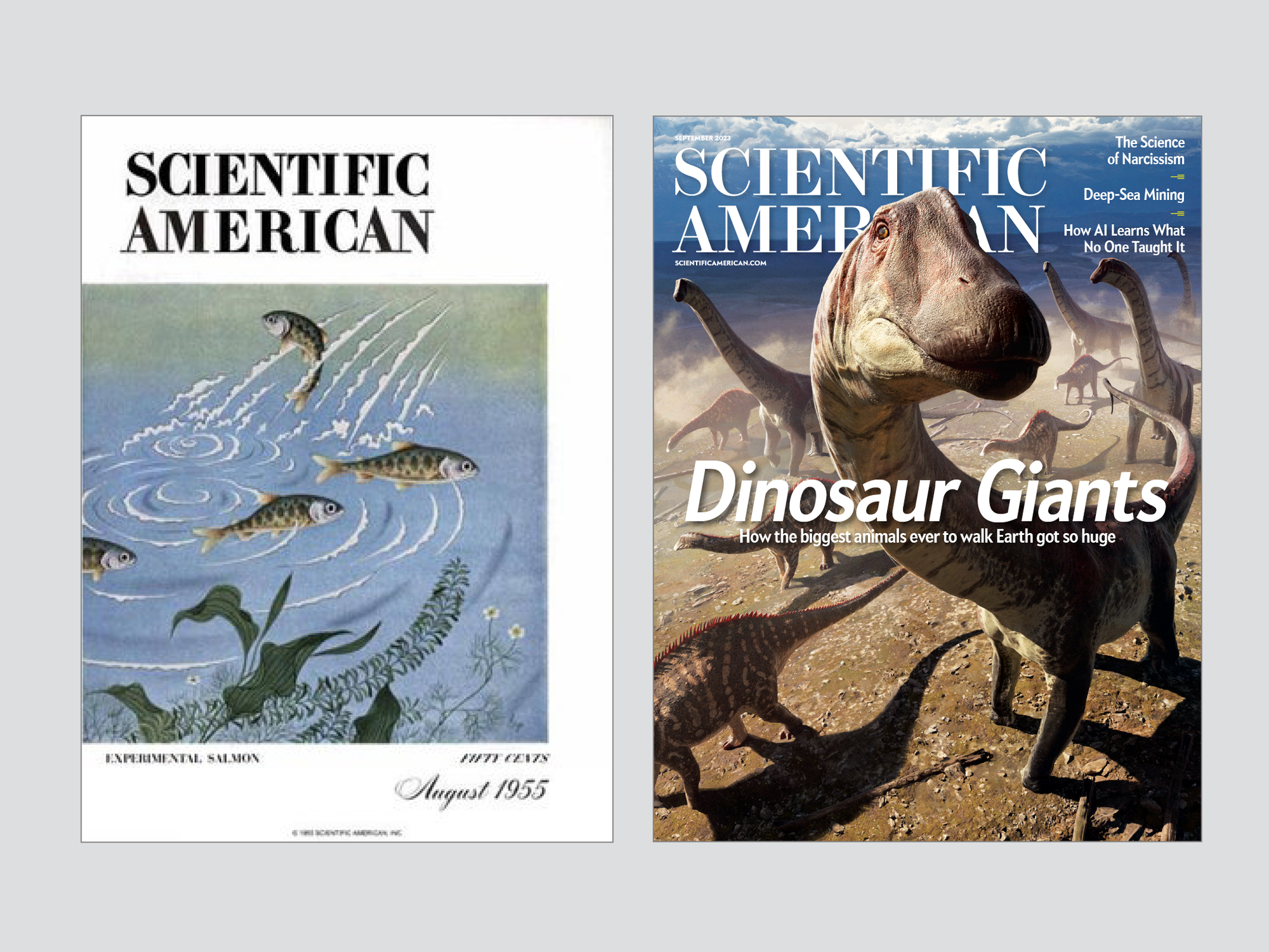
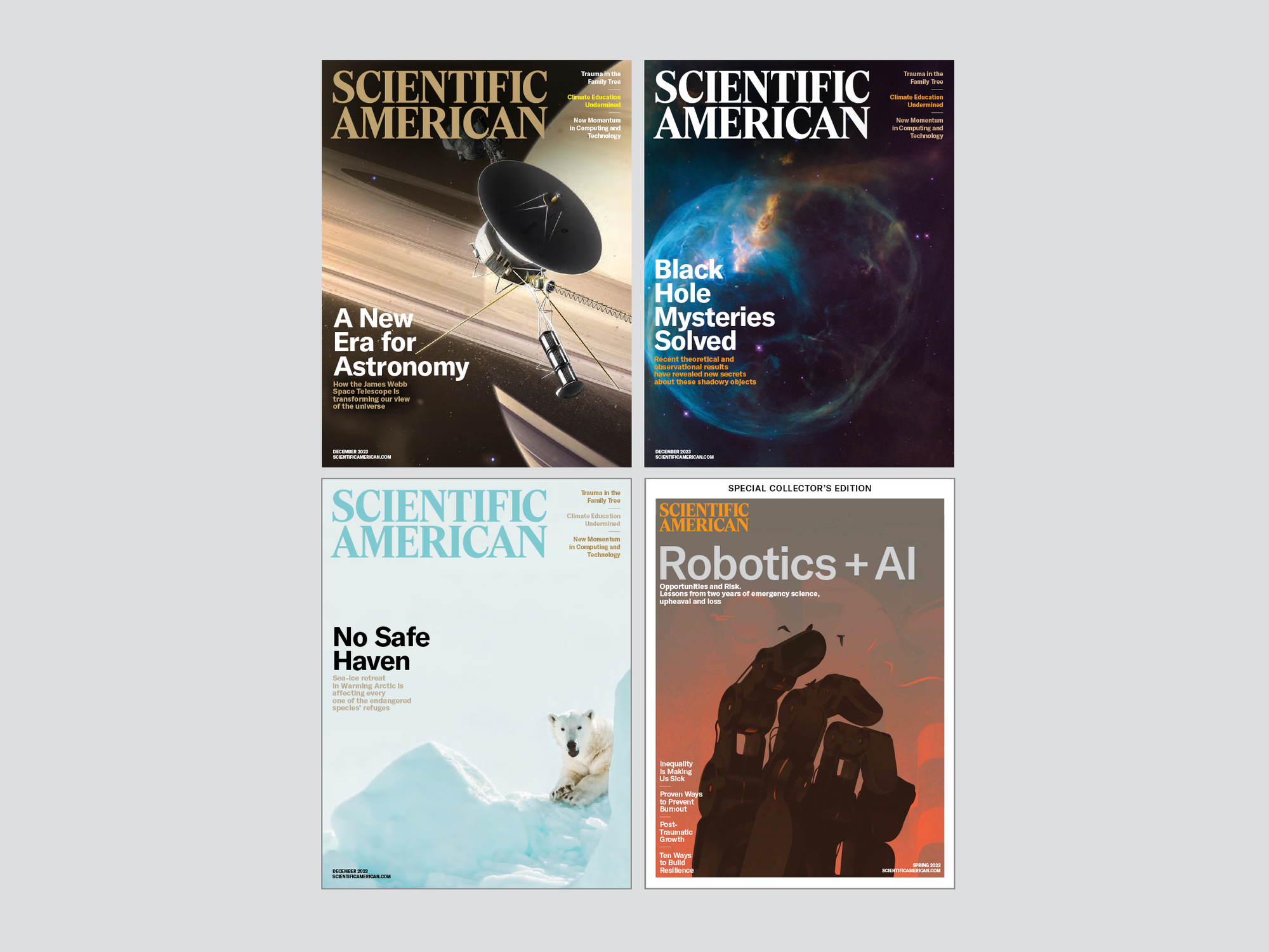
The first thing we explored was our branding. This helped us to set the tone for Scientific American as a whole and to make good, concrete decisions about the overall design. We knew we wanted a more modern approach to the brand, but it was important not to alienate the readers we have, and it was nice to be able to look at our 178-year history for inspiration. The Pentagram team looked through our archive to pull ideas and start down this road. The logo that we were moving forward from was really a nod to our 1948–2001 period, one that is fondly remembered by many of our current readers.
This was our starting point. The Pentagram team, in conjunction with Scientific American, started thinking about new directions. Our intention was to evolve the brand to a more modern interpretation of what we have been but to make sure that our online presence was easy to read and clear across all platforms. To do this, we looked at the placement of our brand across the Internet, especially on social platforms such as Instagram, Twitter (now X) and importantly TikToK, where we wanted to make a push of our brand. The most important part of the logo development was to make sure that there was a connection between the small icon known as a “favicon,” or what we lovingly call the “meatball,” and the brand logo. To that end, Pentagram explored some options, and we were presented with the following.
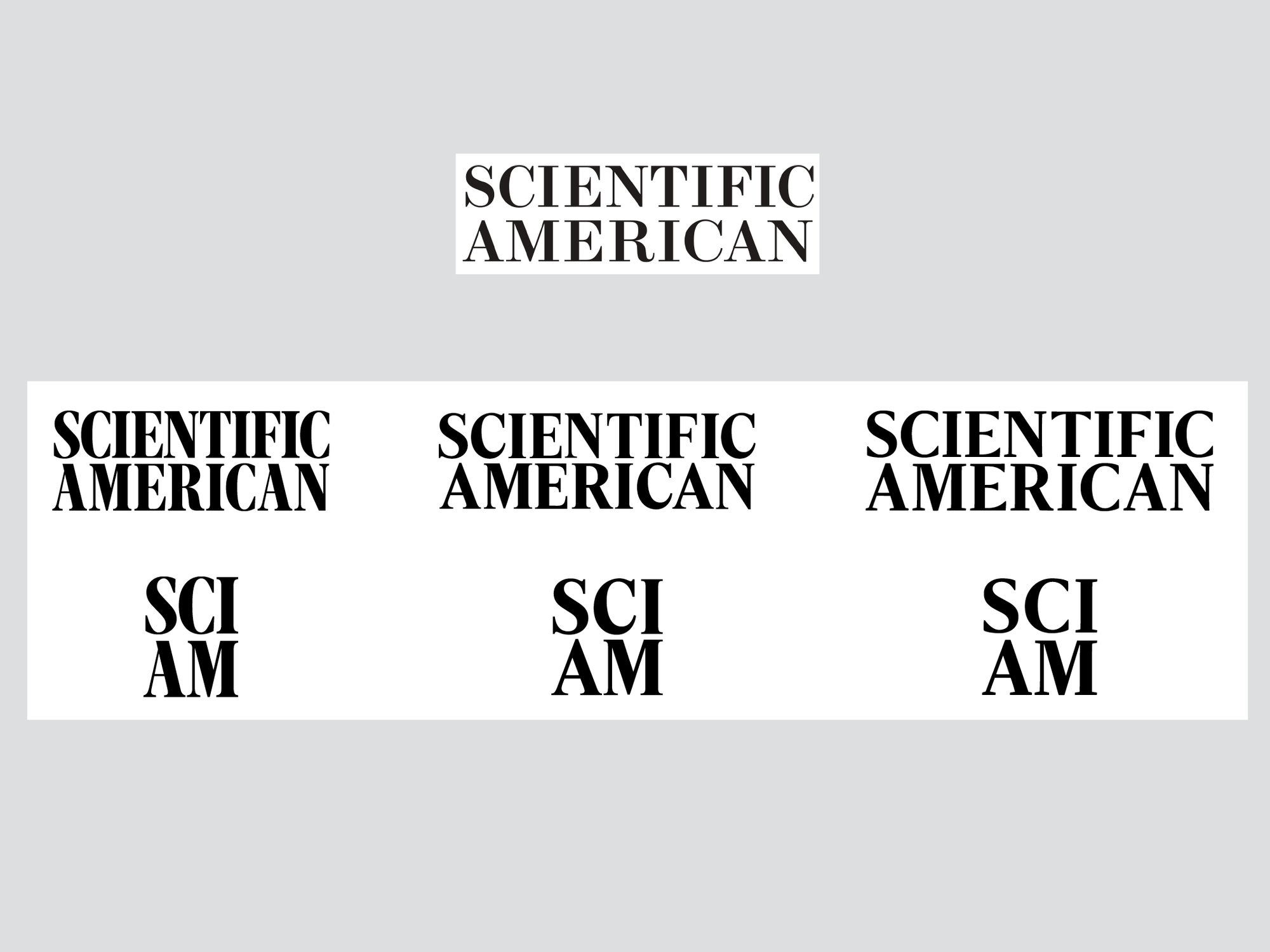
All of these reflected our rich history and “talked” to it so that the brand wouldn’t feel completely changed from our last redesign. And all had pluses and minuses to me and the staff. We were able to discuss this and crowdsource opinions among us. When the dust settled, we decided on this choice.
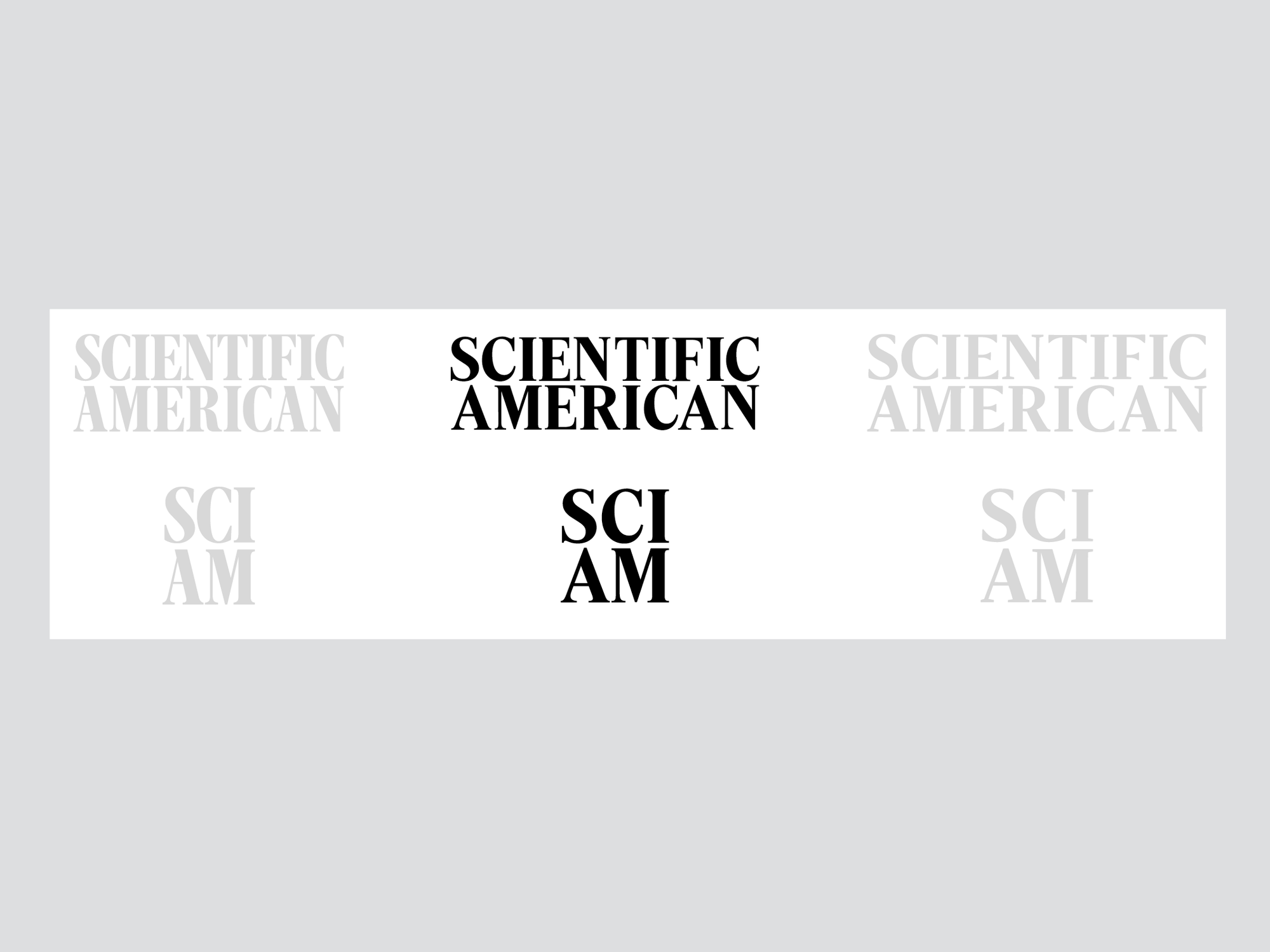
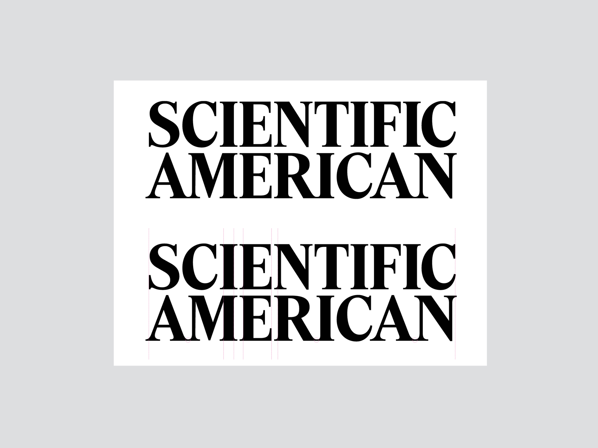
It may seem like this was all we’d need, but it was just a new place to start our next steps. We then refined the logo and favicon to make sure that they “felt” right. As you can see below, we moved most of the letterforms to help close up gaps and make the logo and brand feel as important as it is.
This also started the new path about how this logo would influence our publication and online brand. One thing we knew we could do was change the overall look of the entire printed magazine. Our redesign would have to be more limited on the Internet because much of our online brand is spread across other sites. Yet some of its influence would still be felt even on the sites that we had little control of. The branding is important to make an overarching presentation of our brand, but the images, graphics and other design also help to maintain our visual identity throughout the Internet.
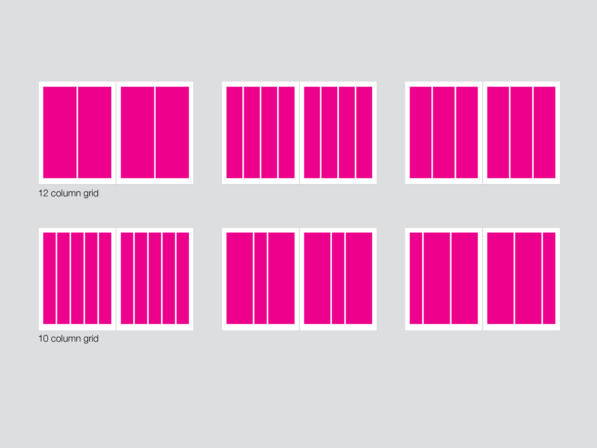
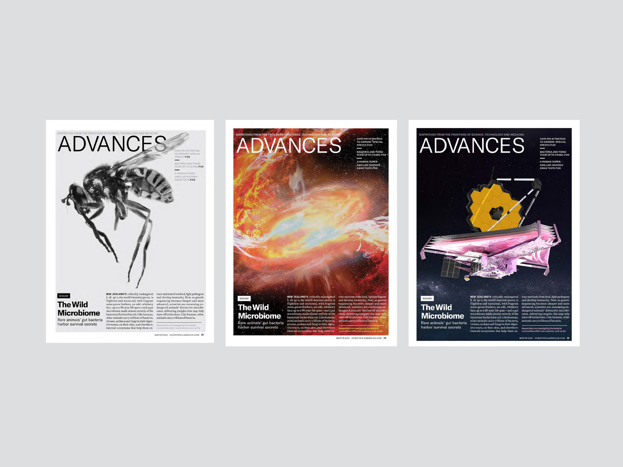
The first thing we did for the print publication was think about an overall grid structure to underpin the entire issue. We preferred a flexible grid that would allow for maximum efficiency with our design.
It also helped influence our font choices. In addition to a more modern and modular presentation, we also wanted to make sure that we were thinking of the reader. (For example, we wanted to make the type a bit larger to make it easier to read.)
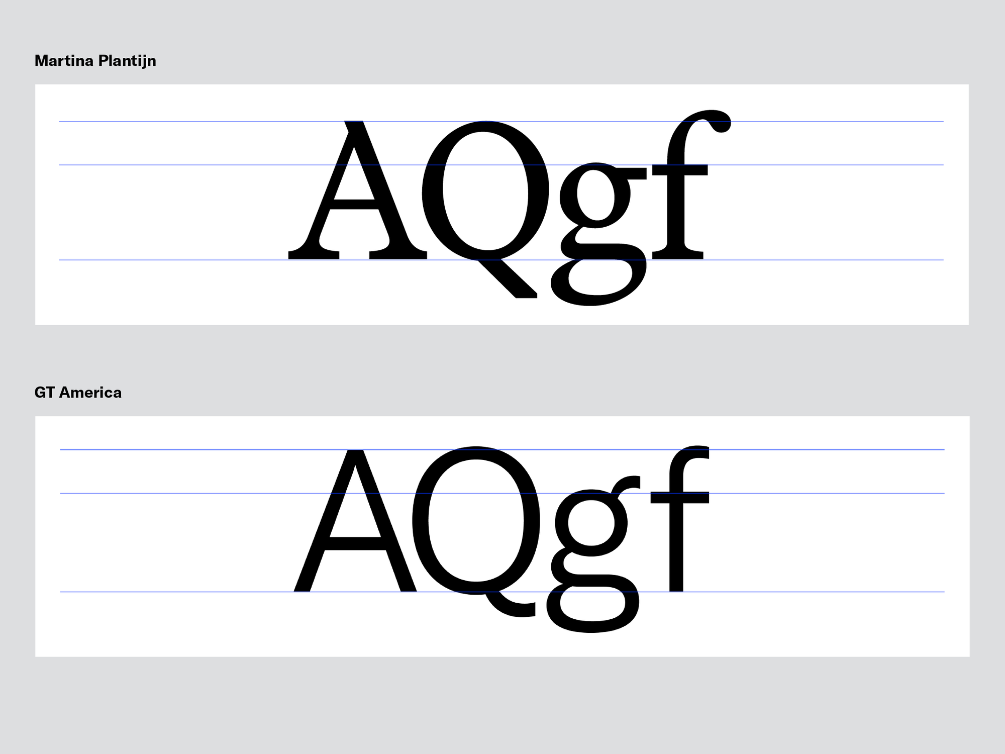
The two new typefaces above will also eventually translate to our site and contribute to a uniform look we want to have between our channels (online and in print). They will also help with overall production by making it simpler to make presentations for both channels.
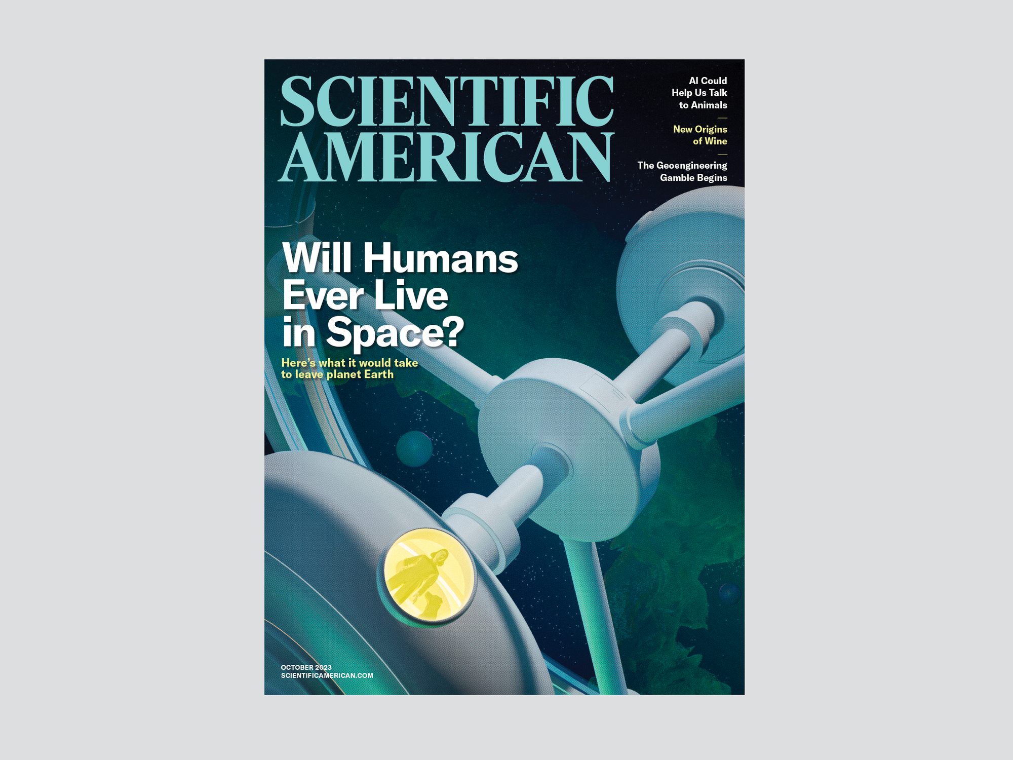
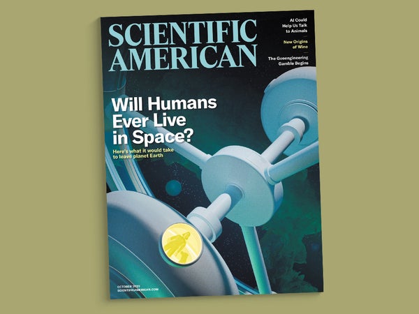
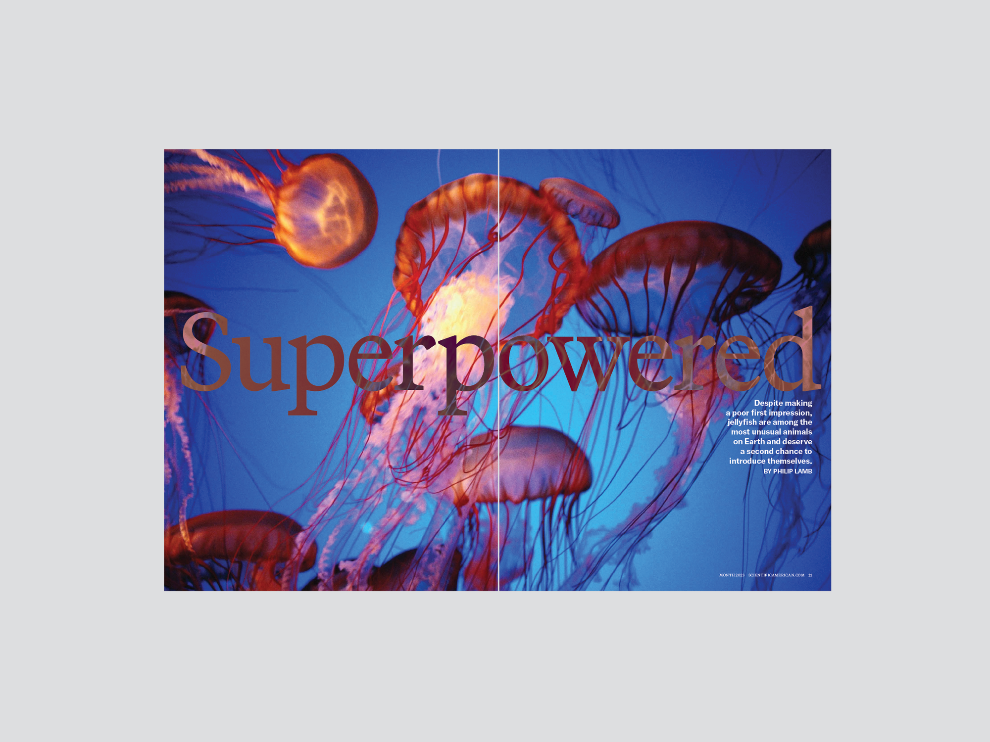
Now we were really moving ahead. Seeing the print designs allowed us to start truly thinking about what the issues and their contents might look like: bolder, easier to read and something a little different, a bit more fun. For the last item, we wanted to make the information more approachable. A modern twist on this was to take what we had been doing, a very black-and-white presentation of our logo and contents, and make it more colorful and engaging. The print edition in particular will have more color and design to help readers engage with the stories.
In addition to the new branding, in the next few months, with novel infrastructure in our online hierarchy, will see a new structure that will make the online presentation much more approachable and allow the amazing stories that we are producing to have that much more impact.
Thanks to our design partners at Pentagram—Luke Hayman, Shigeto Akiyama and Rob Hewitt—and especially our staff, our editor in chief Laura Helmuth and our president Kimberly Lau for being so supportive and helpful in this long satisfying process.