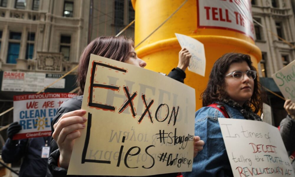

Earlier this year, ExxonMobil released its annual Advancing Climate Solutions report detailing the company’s current and planned contributions to a net-zero future. Put another way—earlier this year, ExxonMobil released its annual greenwashing report, outlining its purported progress towards addressing climate change, a problem the company helped to create.
I reviewed ExxonMobil’s two most recent reports (2023/2024) to evaluate the scientific rigor of its claims. And as a scientist and data visualization enthusiast, I found the reports misleading at best, dishonest at worst, and nowhere is this more obvious than in the graphs. These reports prey on the audience’s lack of scientific literacy, and rely on slick, colorful, and yet meaningless graphics to do so—a sign that while ExxonMobil’s strategy may have changed, its output of disinformation continues.
The importance of figures
Like so many scientists, I learned to evaluate scientific papers by starting with the figures. Tables, graphs, and maps showcase the evidence and underlying data that scientists use to support their results and conclusions.
By looking at a graph, you can learn important information like how many measurements or observations were made, what units they were made in, the geographic extent of the research, and the type of models used—all which provide information that help to interpret findings. If a paper is working with a sample size of one, for instance, that’s going to determine how broadly applicable their findings may be. Similarly, if a study modeled the impact of rising temperatures in arctic tundra, I won’t be assuming those results translate to ecosystems like tropical savannahs.
Figures also allow scientists to communicate uncertainty, a critical part of any scientific endeavor. Conversationally, uncertainty means something you don’t know—like I’m uncertain what I’m going to have for lunch (just kidding, I’m having beans). But scientifically, uncertainty means how well we know something—more like a confidence range, and usually visualized with confidence intervals or error bars depending on the data (I’m 90-95% confident that I’ll be having beans for lunch).
Measuring and communicating uncertainty is essential to good science, which is why graphs are such a good place to start when reading a scientific paper—on their own, figures can contextualize raw information, communicate uncertainty, and visualize key takeaways.
Graphs I love
To illustrate this, here are two stellar examples:
The Keeling Curve – Dr. Charles Keeling’s magnum opus illustrating 60-plus years of atmospheric measurements
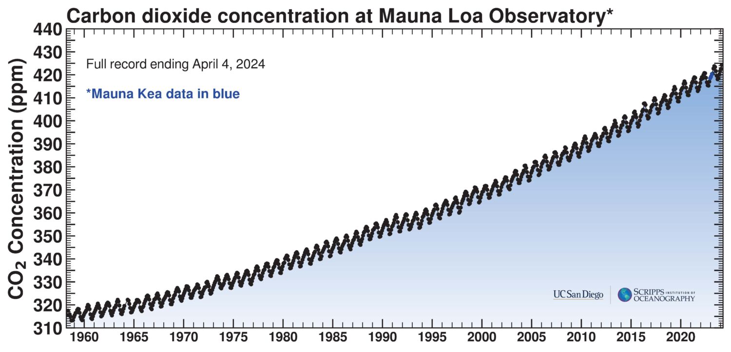
Things I love about this graph:
- clear takeaway—a steady increase in atmospheric carbon dioxide concentrations between 1958 and present day
- consistently labeled axes
- obvious explanation of a very small color change
- no uncertainty—but that’s expected since this is visualizing unprocessed data from a single source
Burned area vs VPD (vapor pressure deficit) from UCS’ 2023 Fossil Fuels Behind Forest Fires

Things I love about this graph:
- clear takeaway—tight relationship between burned area and warm season VPD in forests of North America
- color coded points by year
- clear confidence range for modeled relationship indicated by the dashed lines
- clear communication about the base10 log scale on the y axis
- inset map showing distinguishable forested ecoregions
Graphs are powerful tools for communicating dense, complicated information, but, as we’ll see in Exxon’s Advancing Climate Solutions report, they can also impart the appearance of scientific rigor to a deliberately misleading exercise.
Colorful yet meaningless graphs in ExxonMobil’s report
Like any good scientist, I started my analysis of ExxonMobil’s climate claims by evaluating their figures. While this blog can’t address every graph in their report, I focus on two they say are “detailed roadmaps” “backed by a comprehensive approach,’ or rather, the two that lay bare the emptiness in their claims.
Let’s start with the graph formally titled “Potential GHG Abatement options for ExxonMobil operated assets supporting GHG emission-reduction plans”—a figure skillfully crafted to show both something and nothing at all.
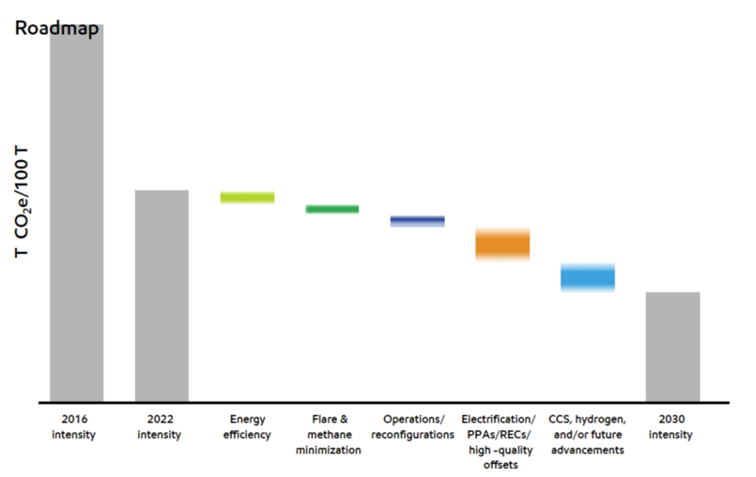
Things I like about this graph:
- accessible color palette for individuals with color vision deficiency or colorblindness
Things that could be improved about this graph:
First, there are no numbers on the y axis. Yikes! That’s graph making 101. On top of that, the units are vague. Instead of reporting ExxonMobil’s absolute emissions reductions, the graph shows relative reductions in emissions intensity—a compound unit that expresses emissions relative to another variable. This other variable can be one of many things leading to units like emissions per dollar of GDP, emissions per units produced, or as seen here, emissions per 100 metric tonnes of throughput or production. They take care to bury those units in the footnotes while also leaving the vague denominator undefined.
(A word about emissions intensity: even with an appropriately defined unit, emissions intensity can be misleading by giving the appearance of reduction while absolute emissions continue to increase. For example, a car company might reduce its emissions per vehicle manufactured, but if cars are flying off the shelves, their total emissions may still increase. Read more here.)
Let’s get into the colored bars next, which show the categories through which ExxonMobil will achieve these alleged and unmeasurable reductions. The company’s graphic designers appear to be visualizing uncertainty using color gradients, an untraditional choice which, by design, doesn’t convey any useful quantitative information.
The categories themselves are worthy of interrogation too, particularly since the majority of ExxonMobil’s reductions in emissions intensity (you know, the stuff measured in tonnes of emissions per 100 tonnes of undefined throughput) include undefined acronyms like PPA (power purchase agreement) and REC (renewable energy credit), unscaled technologies like CCS (carbon capture and storage) and hydrogen, and/or future advancements, that latter of which, by definition, do not yet exist.
(A word about CCS : this technology has existed for decades but is only used at a handful of fossil energy facilities. While the IPCC mentions the value of CCS, the 2023 synthesis report also notes, “Currently, global rates of CCS deployment are far below those in modelled pathways limiting global warming to 1.5°C to 2°C,” and, “Implementation of CCS currently faces technological, economic, institutional, ecological-environmental, and socio-cultural barriers.” In addition, environmental justice advocates and frontline communities routinely point to the danger of concentrated carbon dioxide, embedded siting inequities, and the use of CCS to distract from the real work of phasing out fossil fuels.)
Who needs units anyway?
Another visualization they use is a roadmap is paired with an abatement curve, showing the costs of emissions reduction strategies compared to the amount of mitigation benefit they provide. These kinds of curves are fairly standard when comparing strategies to address climate change as you can see in the comparable figure below. Again, there are no numbers on the X or the Y axes. Double yikes! And no units either. Yikes! Yikes! Yikes!
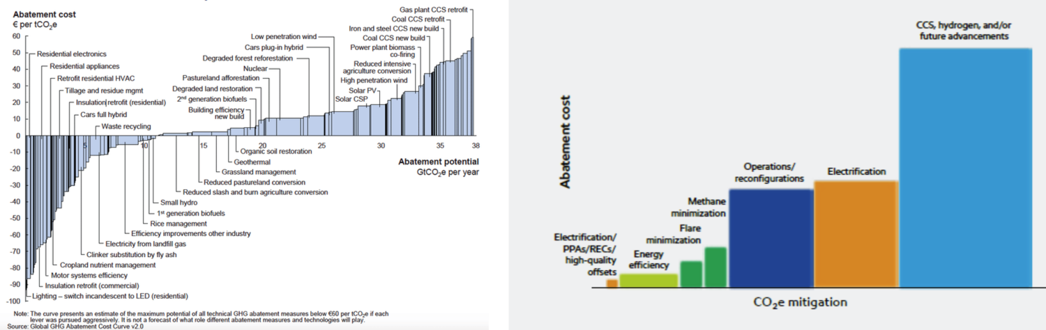
In the abatement curve on the left, the units and scale are interpretable—we can see that cost is in euros and that abatement is measured in gigatons of carbon dioxide equivalent per year. Exxon’s figure shows relative changes in cost (as measured in…?) and mitigation potential (as measured in CO2e, but on an undefined scale). And the oil and gas giant again prominently features CCS, hydrogen, and/or future advancements—this time as a relatively expensive strategy that is currently not operated at the necessary scale but with high potential for abatement. Eek!
Why do Exxon’s greenwashed graphs matter?
While ExxonMobil’s strategies have changed, its output of disinformation continues.
Sure, these figures are pretending to highlight relative reductions from 2016 to 2022 to 2030 and the different categories and costs of activities those reductions will contribute, but devoid of any real numbers or interpretable units, my main takeaway from these figures is that ExxonMobil is putting loads of resources and effort into maintaining the illusion that the company cares about climate change, when in fact, a cursory review of these graphs shows that the company is doing very little, if anything, to meaningfully address the climate crisis.